On March 30, 2020, the Ontario government enhanced its daily reporting of COVID-19 cases in the province. We summarized how these enhancements – especially the daily epidemiological summary – might address our critique of the government’s earlier reporting.
Shortly after introducing its daily epidemiological summary, the Ontario government also began publishing daily updates of confirmed positive COVID-19 cases in the province.
With a view to making these data more accessible and meaningful to the general public, we have been exploring different ways of visualizing the spread of COVID-19 over time and space.
Our first example was an interactive map of the growing number of confirmed cases of COVID-19 by Public Health Unit (PHU) in southern Ontario over a 45 day period (February 22 – April 6, 2020).
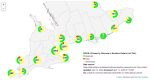
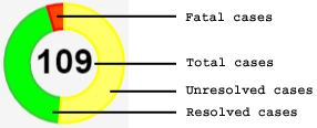
Our next example is an interactive map of clusters of 7,344 COVID-19 cases, classified by Outcome (Resolved, Fatal, Not Resolved), identified by PHUs in southern Ontario, as of April 13, 2020 (view fullscreen version).
About interpreting and interacting with the map:
- Depending on the resolution (zoom level) you select, a clusterpie may display the cases reported by a single PHU or the aggregate of cases reported by multiple PHUs.
- Clicking on the +/- widget in the topleft corner will increase/decrease the zoom level.
- The number in the centre of a clusterpie represents the total number of cases reported by one or more PHU(s). The coloured “slices” of a clusterpie represent cases where the Outcome is Resolved, Fatal, or Unresolved (see below). Hovering your mouse over a coloured slice displays the number of cases with that Outcome.
- Clicking on a clusterpie that represents the aggregate of cases reported by multiple PHUs will increase the zoom level, thereby disaggregating the cases further.
- Clicking on a cluster pie that represents the cases reported by a single PHU will display simple circles (coloured according to Outcome) for the individual cases within the PHU’s catchment area.
- Clicking on an icon will display more detailed information (e.g. case id, likely date of exposure, age group, gender, likely source of exposure, outcome, PHU) about the individual case.
About the location of clusterpies and simple coloured circles on the map:
- A clusterpie that represents the cases reported by a single PHU is located at the centre of the PHU’s catchment area.
- A clusterpie that represents cases reported by multiple PHUs is located in the general vicinity of these PHUs’ catchment areas.
- The location of a simple coloured circle does not indicate anything about the individual’s location within the PHU’s catchment area. To protect privacy and personal health information, the only information about an individual’s location that is reported publicly is that their illness was initially reported by a specific PHU.
In this exercise, we have relied on the contributions of many supporters of the free and open exchange of technology and information. We are especially indebted to Bård Romstad for his development of clusterpie markers to map personal accidents and injuries on the streets of Oslo, Norway.
This work is licensed under a Creative Commons Attribution-ShareAlike 4.0 International License.